Read the original article in Japanese
English adaptation of a Japanese article published April 2026. This describes the author's working design-guidance pattern, not a guaranteed way to improve output quality.
AI-assisted interfaces and articles can look superficially polished while missing the intended depth or tone. I found the idea of a DESIGN.md file appealing because it makes preferences explicit. But applying one universal design file to every deliverable can make the guidance contradictory.
My preferred arrangement has three layers: a shared creative guide, a blog-specific style guide, and a separate design specification for each product.
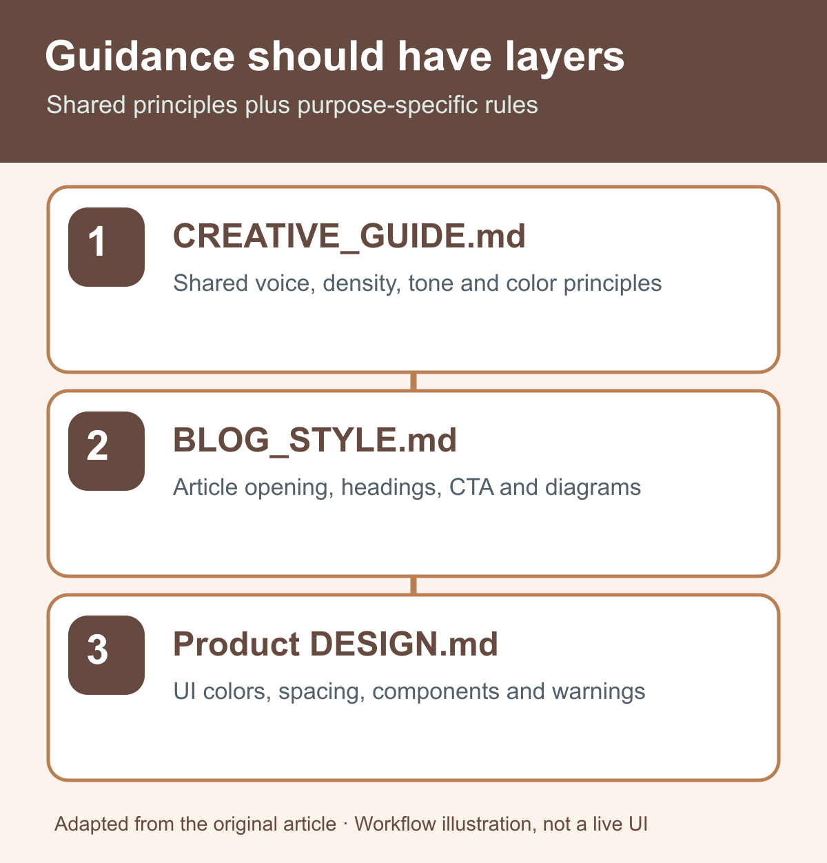
The three-file structure
| File | Purpose | Typical scope |
|---|---|---|
CREATIVE_GUIDE.md |
Shared tone, information design, recurring visual principles, phrases to avoid | All articles, products and documents |
BLOG_STYLE.md |
Article structure, opening, headings, calls to action, diagrams | Blog posts and article-based landing pages |
Product-specific DESIGN.md |
Colors, spacing, components, density, product tone | One application's user interface |
The idea is not that every project must have exactly these filenames. It is that shared principles and specialized constraints should not be confused.
Why one universal file becomes awkward
A product dashboard may need dense data, strong warning treatment and deliberate status colors. A blog article may need a calm reading rhythm, clear headings and restrained calls to action.
If you use the same detailed instructions for both, one medium may end up feeling wrong. A real-estate scoring dashboard's UI rules are too heavy for a normal article; a blog's prose conventions may leave an operational analysis tool underspecified.
The distinction to preserve is:
- Principles that apply to everything I create.
- Rules needed only for the specific kind of output.
1. Shared guidance in CREATIVE_GUIDE.md
My common layer included principles such as:
- Avoid generic-looking SaaS template output.
- Do not make complex information unnecessarily sparse.
- Keep Japanese prose concise and direct.
- Use a restrained palette.
- Avoid empty promotional language such as “revolutionary” or “easy for everyone.”
I would not place a rule like “buttons must have a 16px corner radius” in this shared layer. That is a product-level design decision, not a universal creative principle.
2. Blog guidance in BLOG_STYLE.md
Articles are read sequentially, unlike most application screens. My blog guidance therefore covered:
- Put the answer or conclusion early.
- Keep the introduction concise—two to four sentences was the original rule of thumb.
- Give each section one main point.
- Provide a suitable next action near the end.
- Use diagrams to explain, not merely to decorate.
The goal is a readable article whose structure matches the reader's actual question.
3. Product guidance in each DESIGN.md
For a specific example, I described rules for PropertyScore, including a dark visual base, blue accents, semantic evaluation colors, information density, warnings and CTA treatment.
A portal, analytical dashboard, marketing page and mobile interface need different constraints. Their product files should say what differs, rather than forcing all those details into the shared document.
What this changed in practice
Shorter repeat instructions
Instead of repeatedly saying “make it more formal,” “keep it readable,” or “use fewer colors,” I could refer an AI assistant to the relevant files:
Follow the CREATIVE_GUIDE.md file in your project.
For blog work, also follow article-drafts/BLOG_STYLE.md.
For product UI, follow that product's DESIGN.md.
These paths are examples from my environment. They require the referenced files to exist and to be accessible to the relevant tool.
Clearer feedback on incorrect output
When a UI feels too visually heavy, I can ask whether it violates a common principle or the product's design rules. That is more actionable than an unstructured preference.
Less reinvention for new products
The shared layer provides a starting point. Each new product needs only the additional specific rules. I would rather refine these files as problems appear than attempt to produce a perfect universal guide in advance.
How to apply this to a blog
A blog does not primarily need pixel-perfect component specifications. It needs a clear subject, a short path to the answer, headings aligned with reader intent, and a useful next action.
That is why a specialized blog style file should cover writing, diagrams and editorial checks. A reusable design concept helps, but it does not replace evidence review or judgment about the content.
What I learned
A single magic file is tempting, but layered guidance was more practical in my workflow. Keep the shared guidance concrete enough to be useful. Make specialized rules specific. And treat the AI's first draft as a proposal rather than the final decision.
There is no measured claim here that using these files automatically raises reader engagement or UI task success. The immediate benefit was a clearer basis for instructions and revisions.
Where to start
- Write a short shared file with principles that genuinely apply across your work.
- Add separate rules for articles, landing pages, or other output categories.
- Create product-specific design files only when a product needs them.
- Add or revise a rule when a real, recurring mismatch reveals that it is missing.