Read the original article in Japanese
English adaptation of the Japanese article published April 11, 2026. The workflow describes the author's experiments on ichigoro.com; it is not a measured improvement in traffic or conversions.
A diagram can look excellent on a desktop screen and still fail its main job in a blog post: helping someone understand the explanation. That happened when I tried adding AI-generated technical diagrams to existing articles on ichigoro.com. My first wide illustration displayed correctly, but its text was too small at iPhone width.
I changed the workflow to start with mobile readability, create the image locally, and verify the actual WordPress page after upload.
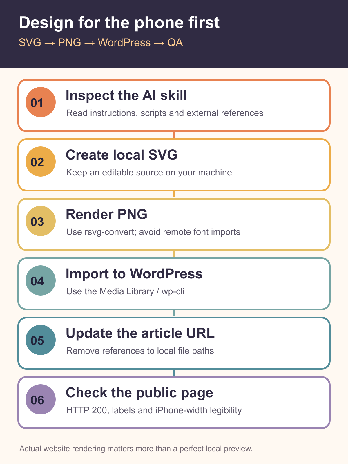
Starting point: a Claude Code diagram skill
I found fireworks-tech-graph, a repository providing a Claude Code skill for generating technical diagrams. Before using it, I read the available instructions and references instead of installing an unfamiliar AI skill automatically.
In the files I inspected, the primary flow was to generate SVG and convert it to PNG with rsvg-convert. I did not see an explicit instruction to extract secrets or send them elsewhere. That is a limited review of what I inspected, not a security certification of every version or dependency.
One reference file still contained a Google Fonts @import example, even though the main guidance discouraged external imports. I removed that example from my local copy and used system fonts for more reproducible rendering.
The separate article about checking skills found on X explains the review process in more detail.
Why a 16:9 diagram did not work
I initially made a conventional 16:9 illustration. It looked reasonable on a PC. At iPhone width, however, the whole image became smaller and the text was hard to read.
The HTML and image URL were not necessarily broken. The problem was the information density inside the image.
I switched to a 1200 × 1600-pixel portrait canvas and stacked the diagram's cards vertically. In the pages I checked, that made labels easier to read on a narrow screen and helped the figure fit into the reading flow.
This was a qualitative display check, not a controlled usability study. It does not establish that portrait diagrams always outperform wide diagrams.
Three posts I updated
I first used the process on three articles in the development-productivity category:
- Codex and WP-CLI for WordPress draft operations: a workflow separating content creation, local drafts, WordPress import, and prepublication review.
- AI tools for engineers: a decision aid distinguishing browser-oriented work from IDE-oriented work before the comparison table.
- Paid tools for blog operations: a diagram grouping tools such as ChatGPT, Notion, Canva, Rank Math, Buffer, and Ahrefs by the bottleneck they address.
The goal was to illustrate a decision or sequence that prose alone made cumbersome. I was not trying to add a decorative image to every paragraph.
The local-to-WordPress pipeline
I kept the editable source on my local machine rather than drawing directly inside the WordPress editor.
- Create the SVG locally.
- Convert it to PNG using
rsvg-convert. - Transfer the PNG to the Xserver environment.
- Import it into the WordPress Media Library using
wp-cli. - Replace the local file reference in the article HTML with the WordPress media URL.
- Fetch the public page and inspect the image at iPhone width.
Keeping the SVG and exported image locally also meant I could review the exact change and more easily recover from an incorrect article update.
Checks after the import
My minimum checklist covered the published URL and rendering, not only whether an image file existed:
- Does the public page reference the intended WordPress media URL?
- Does the image URL return HTTP 200?
- Did a local filesystem path accidentally end up in the HTML?
- Does a secret scan flag anything that should not be published?
- Can a reader make out the labels at iPhone width?
The last check caught the original wide-diagram problem. A successful upload did not prove that the diagram communicated its message.
Risks when using AI skills for diagrams
Review instructions as well as code. An AI skill can change agent behavior through text and reference files even if it contains little executable code.
Avoid unnecessary external dependencies. Remote fonts and icons can change or fail during rendering. I preferred local resources and system fonts in this workflow.
Choose the aspect ratio for the reading context. Portrait, vertically stacked steps suited the workflow and decision diagrams I used. A genuinely wide architecture might need a different presentation rather than squeezing every detail into one tiny image.
Where I would use the workflow next
Agent stop conditions, article-draft pipelines, WordPress operations, and tool comparisons can benefit from a diagram when it clarifies a choice or a sequence. I would place it near the corresponding explanation, check its facts and labels, and validate the rendered article on a phone-sized screen.
The useful result of this experiment was a repeatable SVG → PNG → WordPress → mobile QA pipeline. Better search visibility, reading time, or business outcomes were not measured in the source article.